
Brain Rot Records Logo Design
Year: 2025
Project Overview: Brain Rot Records needed a logo that felt raw, loud, and defiant. The client wanted to explore an illustration style logo with a skull-inspired mark and the letters B and R, while staying open to other visual directions that could capture the energy of the brand.
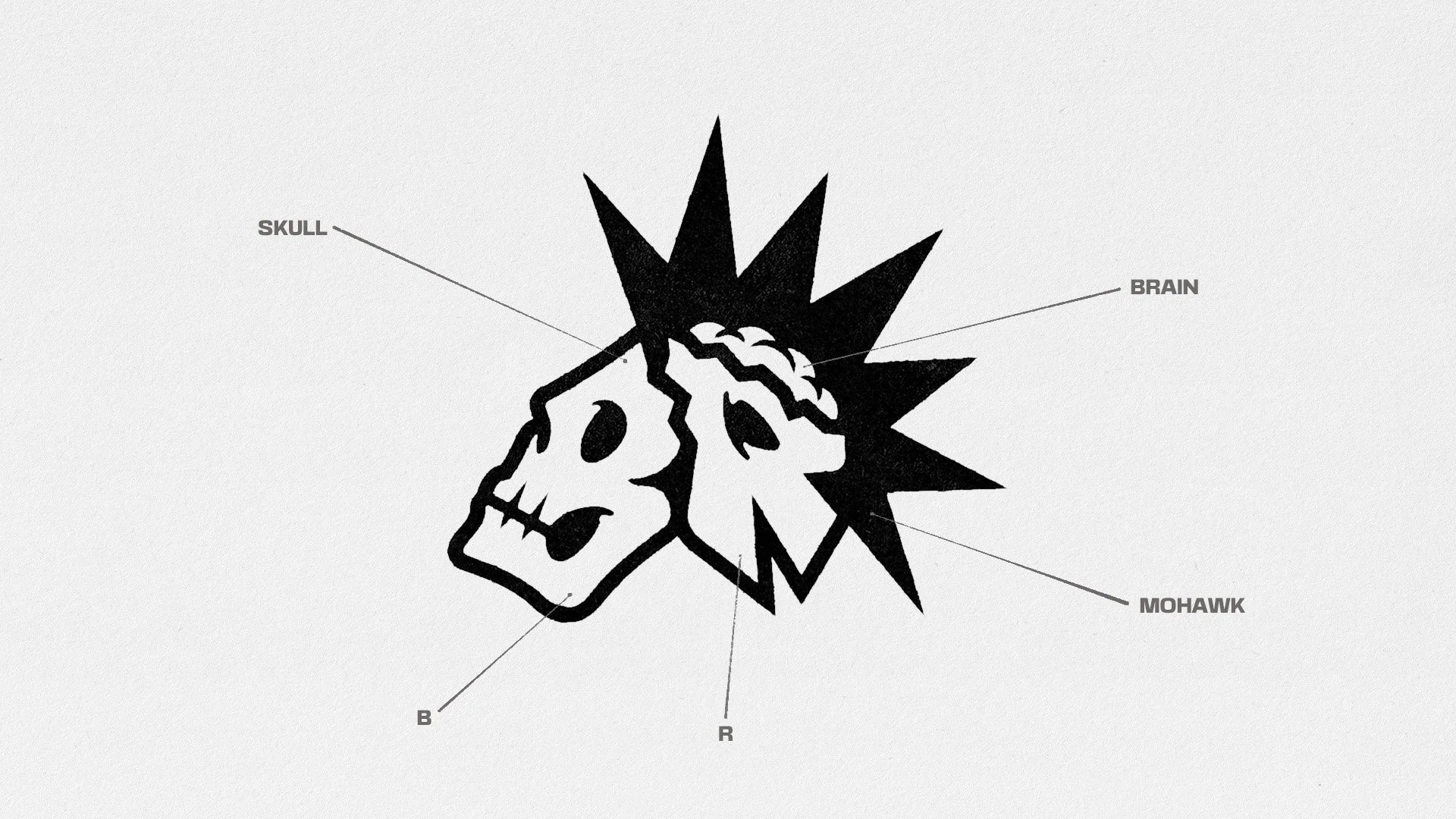
Solution: We developed a custom skull logo built directly from the B and R letterforms, creating a mark that feels both graphic and ownable. We pushed the concept further by showing the skull cracked open, exposing the brain inside as a direct visual nod to the name Brain Rot Records. A sharp mohawk silhouette and custom lettering add to the punk attitude, giving the identity a bold, aggressive, and instantly recognizable look.
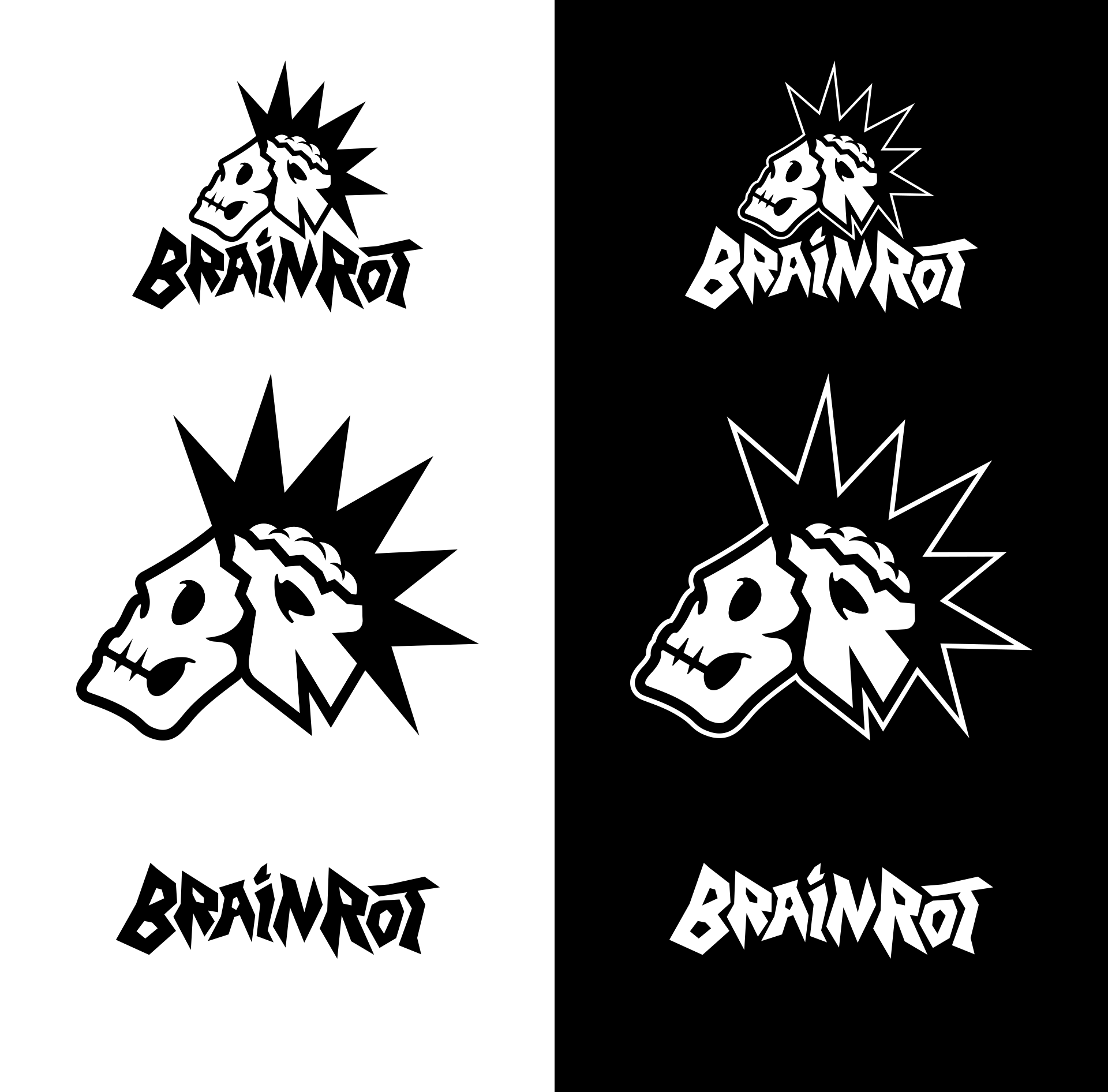
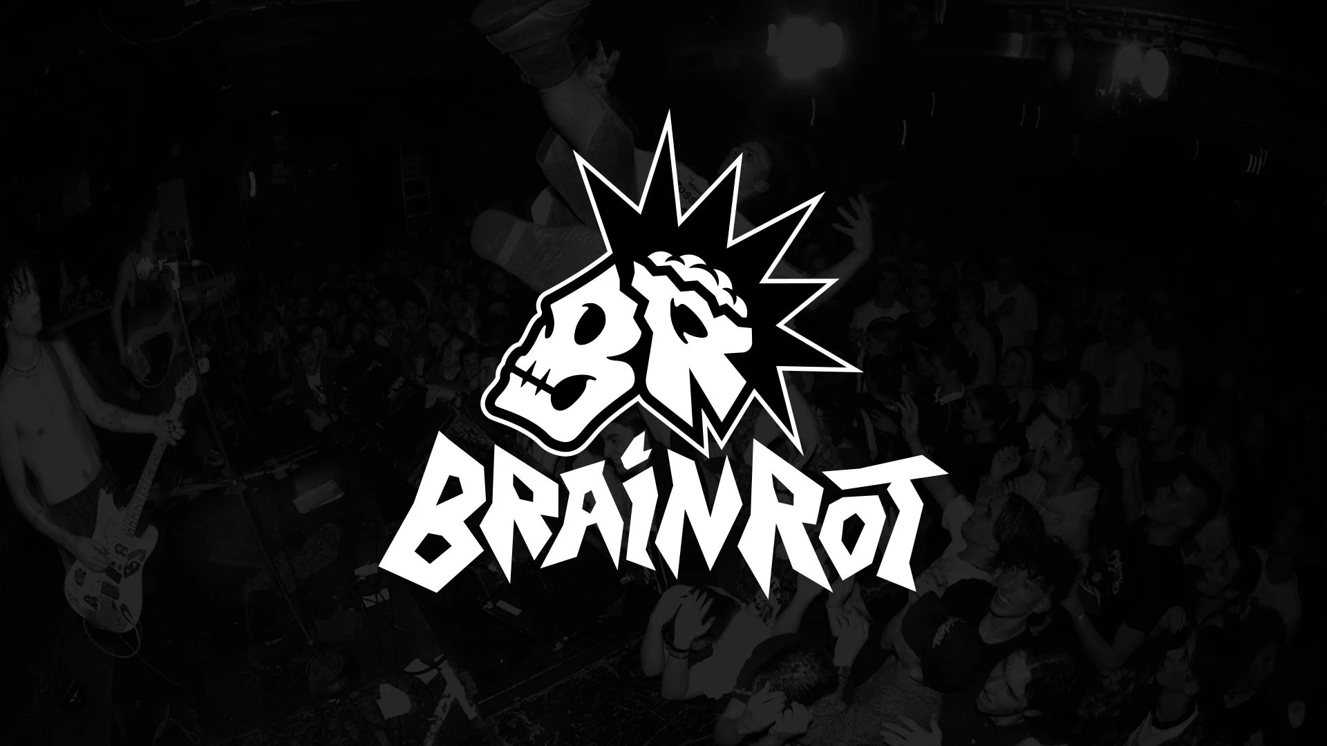
The final logo balances character and readability, creating a flexible mark that feels right at home on record labels, merch, posters, stickers, and other music-driven applications.
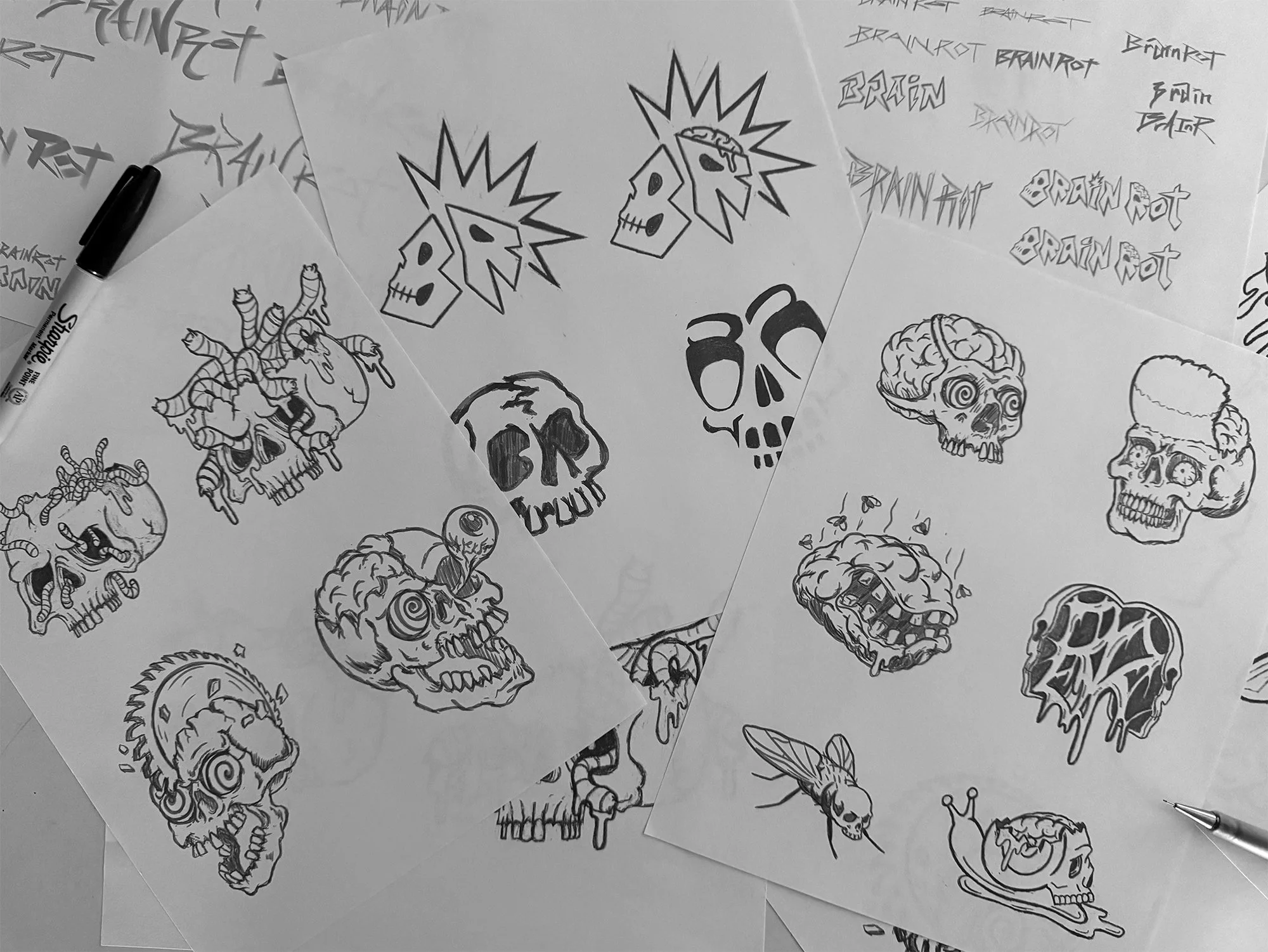
Concept sketches exploring a variety of different directions to get an idea of what the client was looking for.
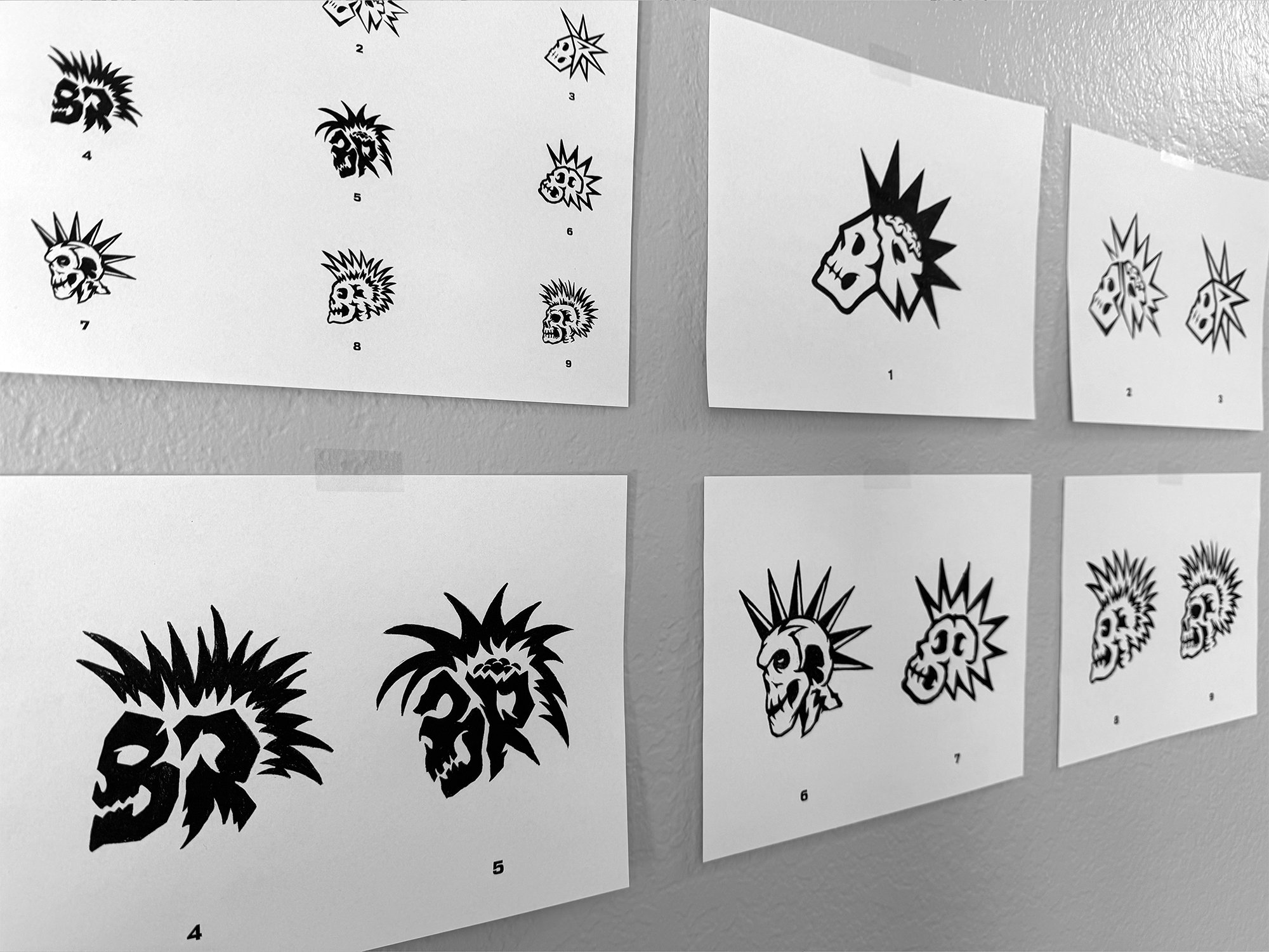
After landing on a concept, we explored a range of styles with variations of personality and legibility.
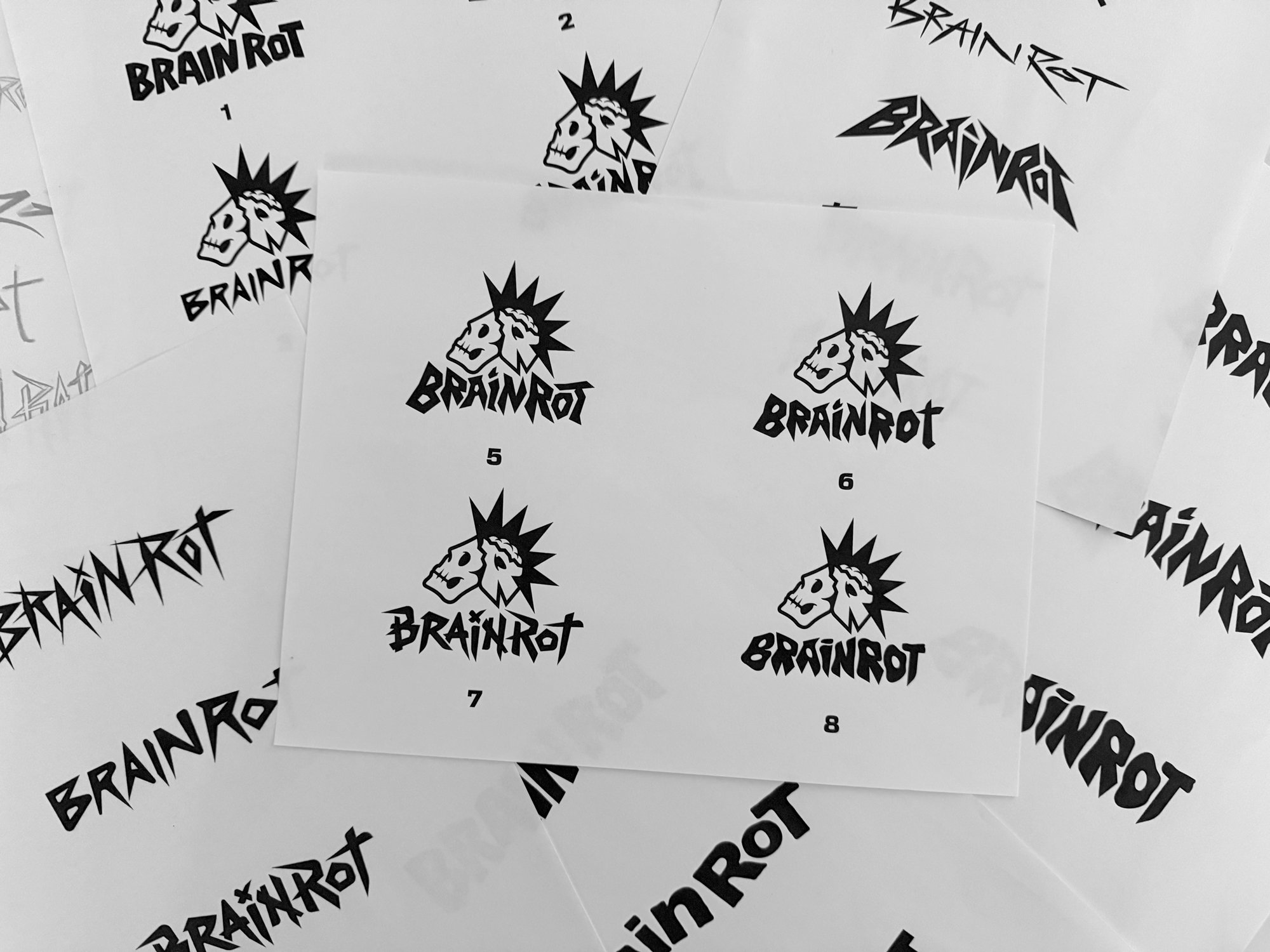
From there, we developed custom typography that matched the energy of the brand mark and felt like a complete unit.