End Overdose Rebrand
Brand Identity, Illustration, and Visual System
Year: 2026
Project Overview: End Overdose needed a brand identity that could move between two very different worlds: professional healthcare and nonprofit spaces, and high energy youth culture environments like music festivals, events, and community activations.
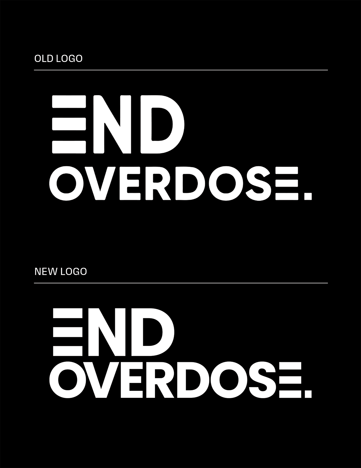
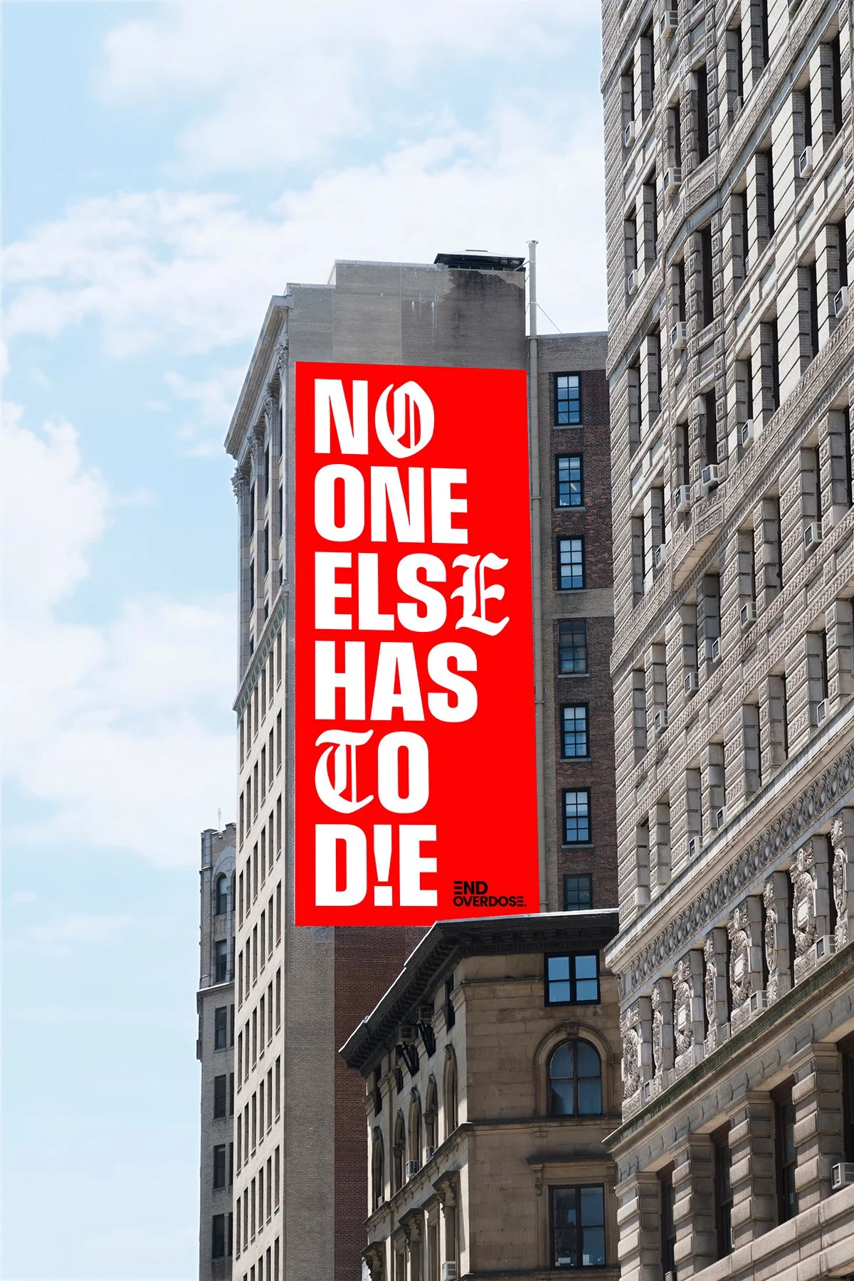
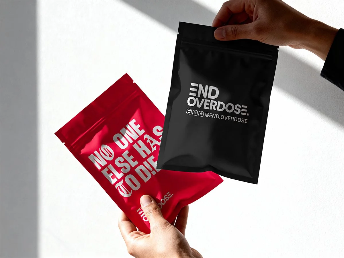
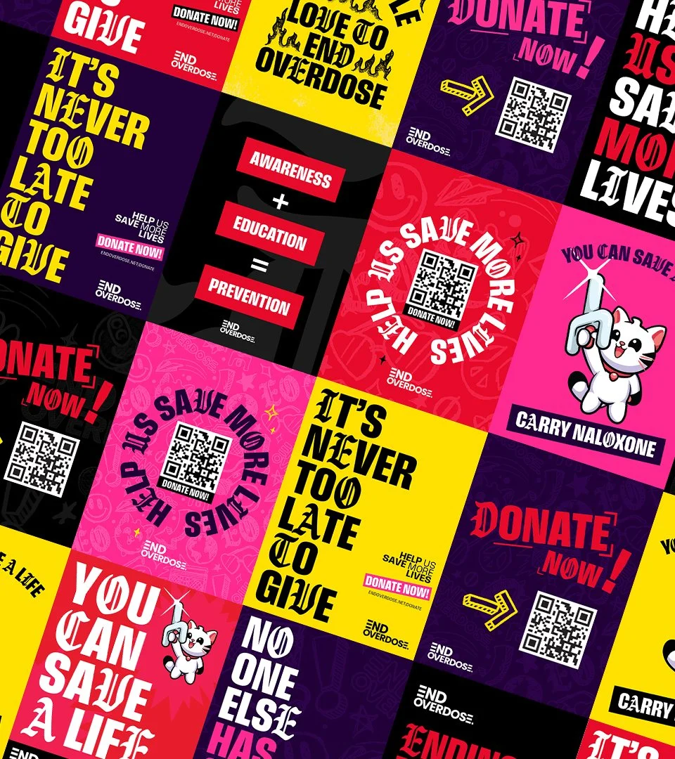
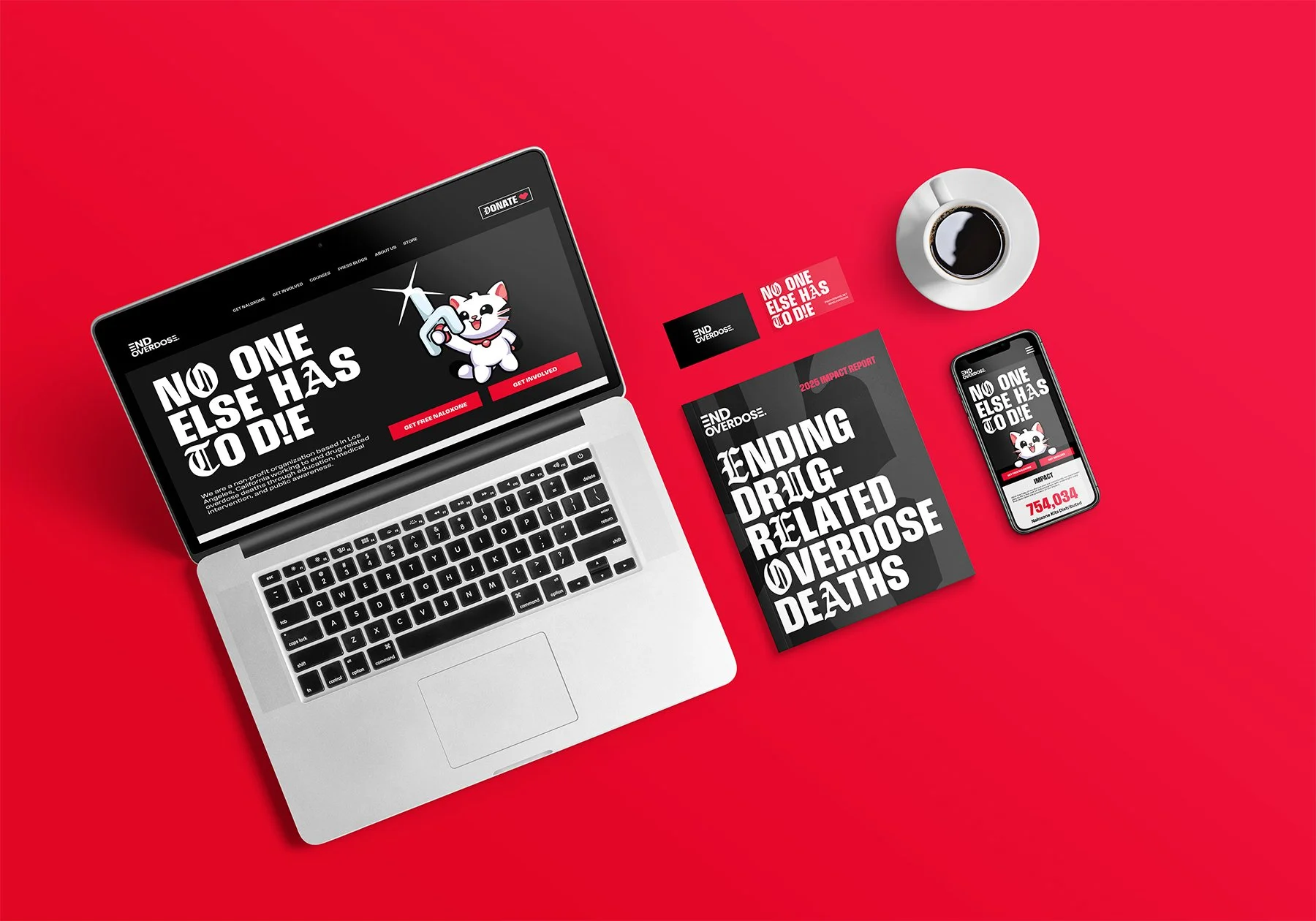
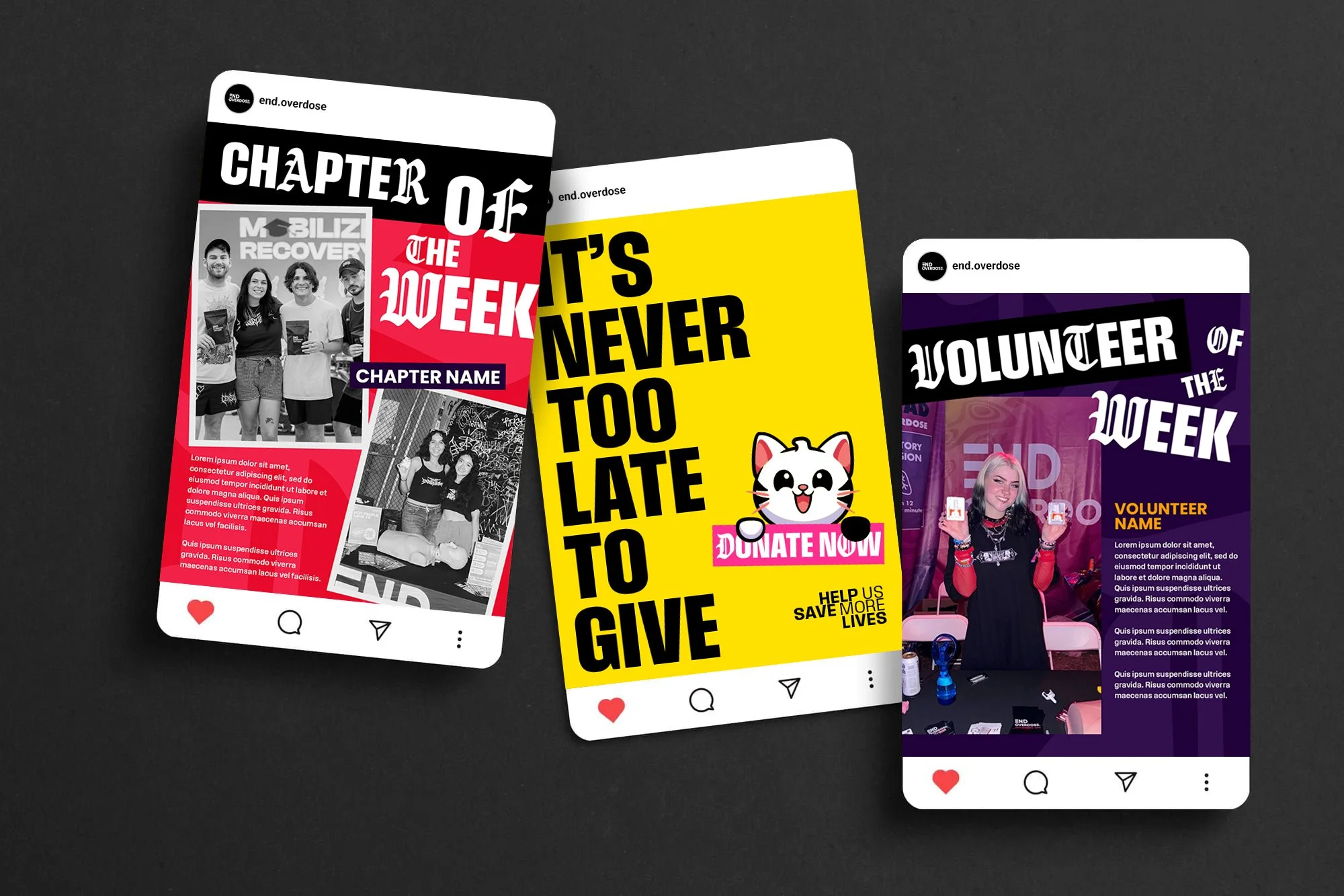
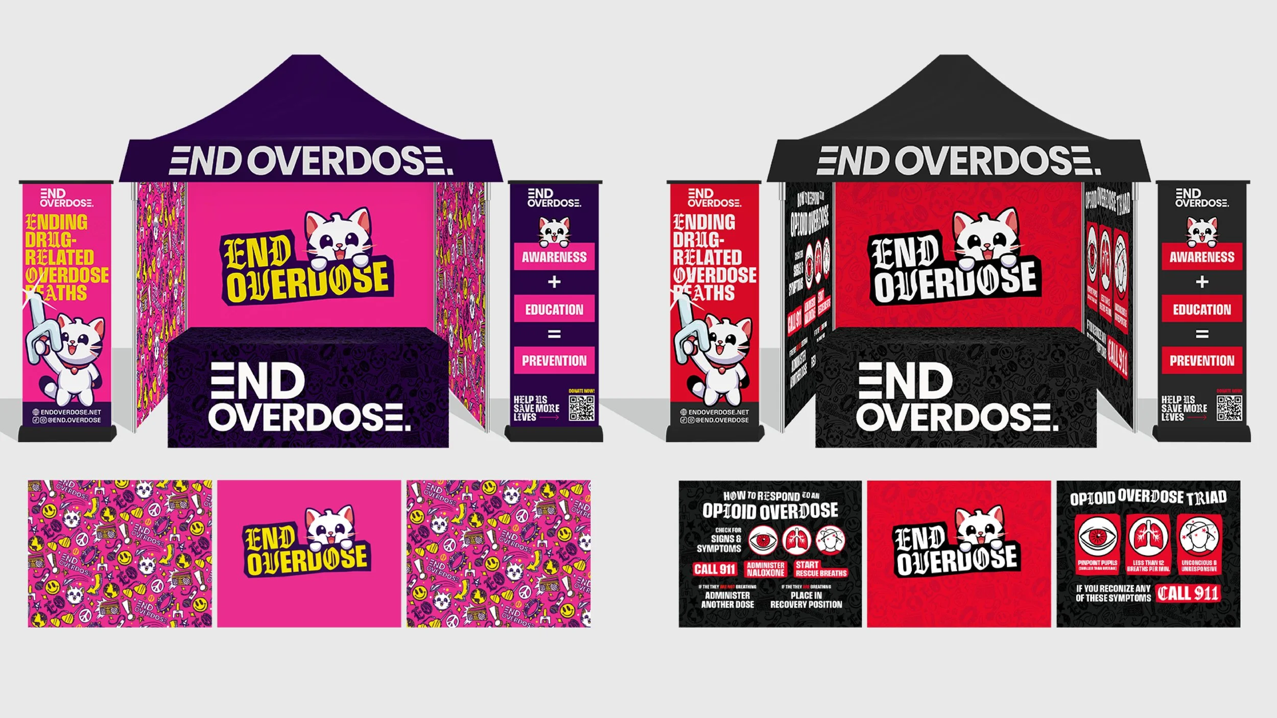
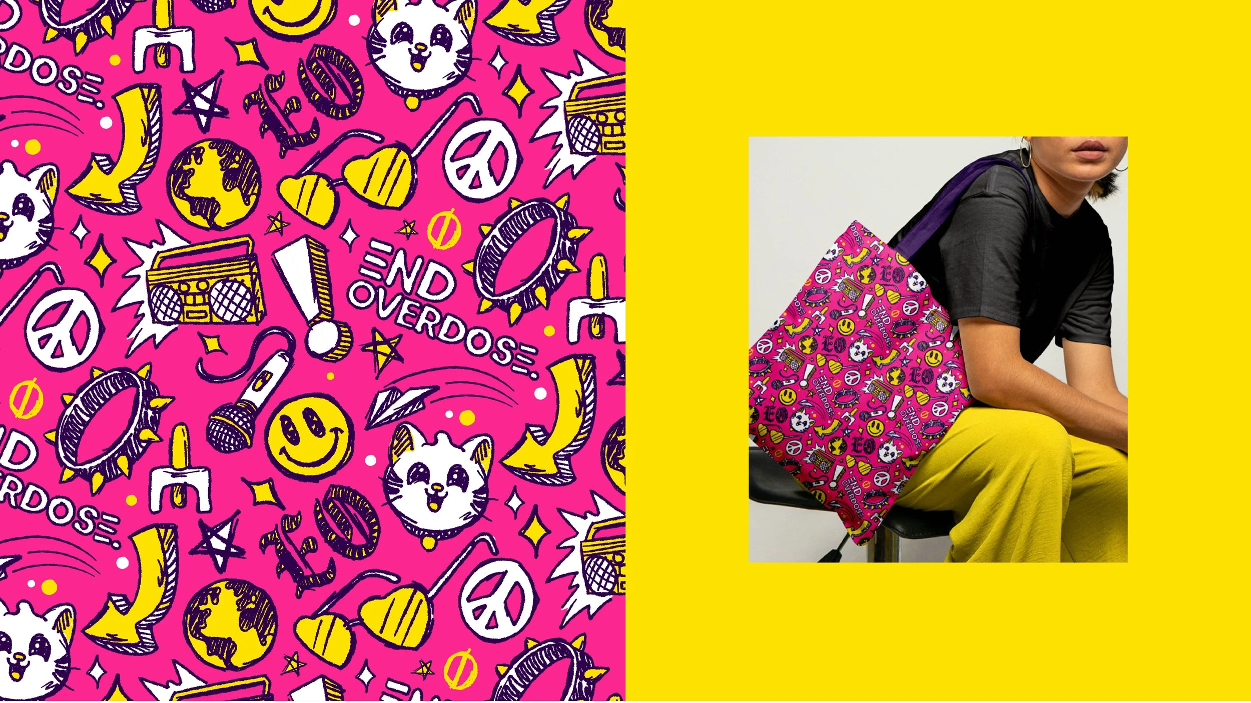
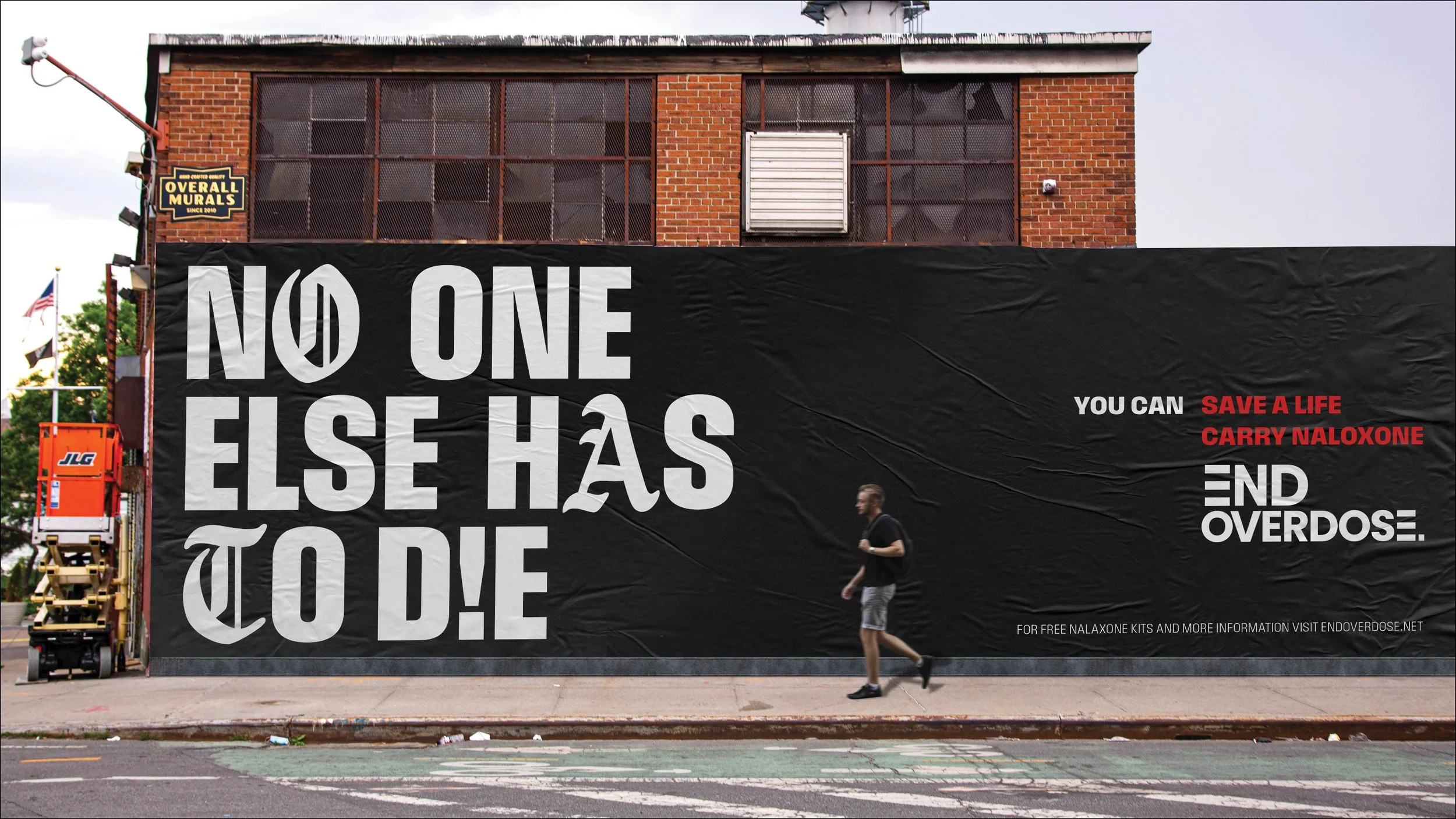
Solution: We refreshed their logo, refining the letter forms and tightening the spacing and built a complete visual identity system including typography, color, patterns, textures, and custom illustrations. The goal was to create a brand that felt credible and trustworthy when speaking to partners, donors, and public health organizations, while still feeling vibrant, approachable, and engaging for younger audiences. It also needed to feel like an authentic evolution of the existing brand, preserving the connection End Overdose had already built with its community.
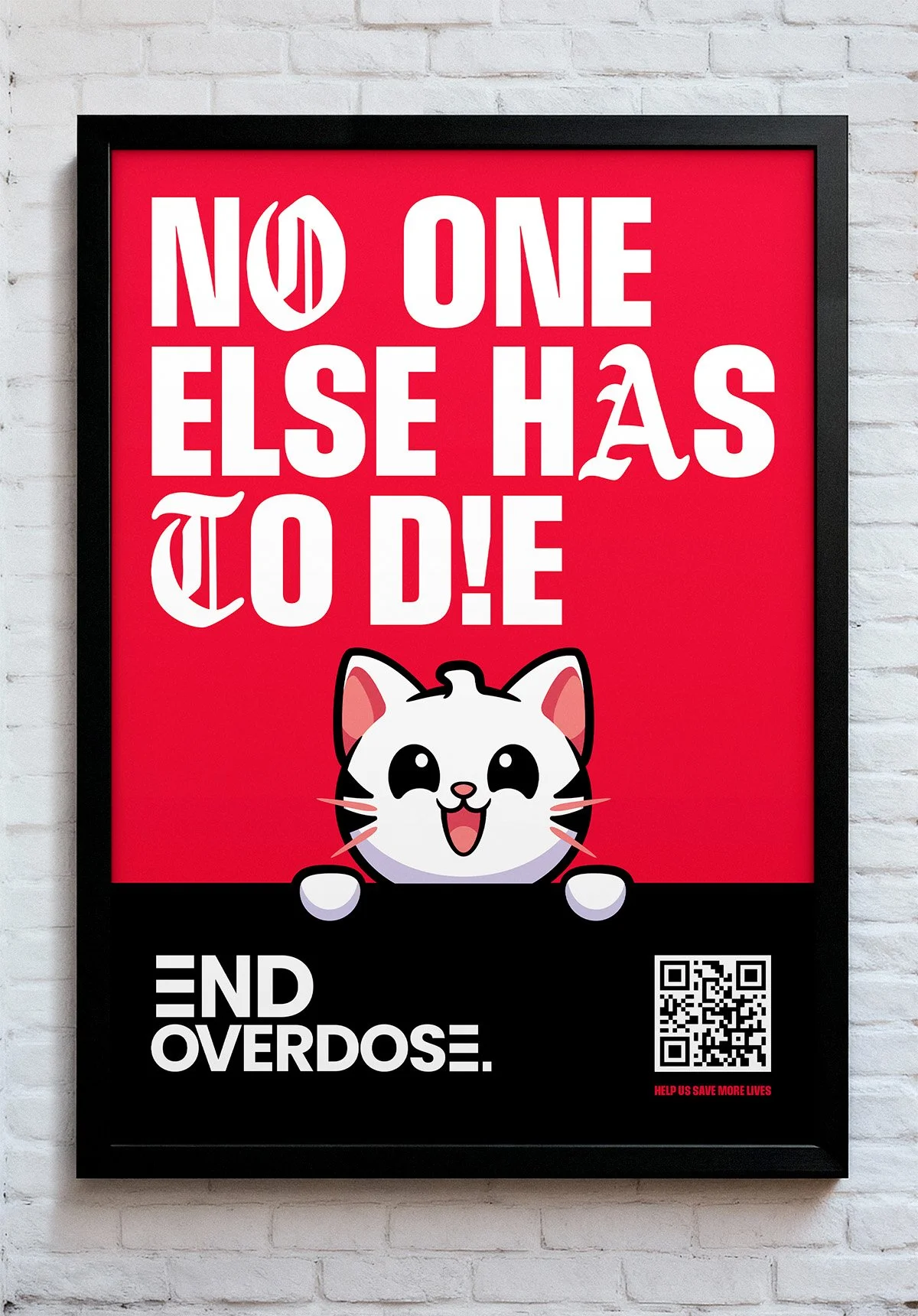
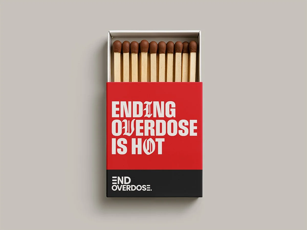
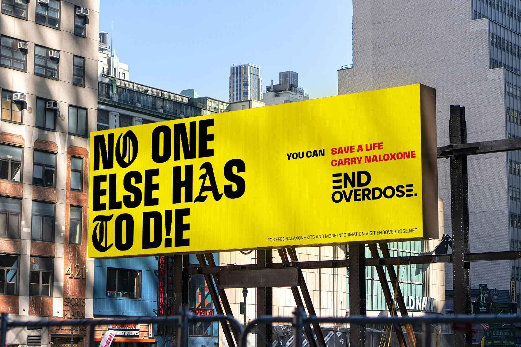
The final identity balances clarity with personality through a refined color palette, bold yet playful typography, expressive patterns, and custom illustrations. Together, these elements give End Overdose the flexibility to show up with professionalism when needed, and with energy, warmth, and impact when connecting directly with the communities they serve.